How I (Re)made my Web Portfolio: Tips, Tools and Best Practices
Sharing the process of remaking my professional website in 2024, using React, Next.js, and Tailwind CSS.
A brief introduction #
If you would like to check the final current result, you can access it at andreseiji.com
I've always wanted to have my own website.
I started my career as a UI designer, and I knew it was important to have a portfolio. It's a practical way to showcase my work. Eventually, I transitioned to software engineering, and along my journey, I've had a few different versions of my website and/or portfolio.
In the early 2010s, my very first website was a template bought in ThemeForest, by Envato. It was a simple HTML, CSS and JS website, using jQuery and Bootstrap. I remember I had to use FTP to upload the files to the server - UOL Host - a Brazilian hosting service.
In the following years, I remade my portfolio using angular.js, VueJS, Angular, React (with Next.js), and even Vanilla JS 🍦. I've used different tools and libraries, like Grunt and Webpack for builds, BulmaCSS, Angular Material, Stitches, Tailwind CSS and others for styling. I've also used different hosting services, like Vercel, and GitHub Pages.
In this article, I'll share my experience remaking my portfolio in 2024. I'll cover the following topics:
- Why I decided to remake my website
- The tools and libraries I used
- The best practices I followed
- The final result
I hope you find something useful. Let's get started!
Why I decided to remake my website #
The previous version of my website was built originally in late 2022 using React 17.x, Next.js 13.x and Tailwind CSS. It was a simple website, with only a landing page containing some info about myself, companies and projects I have worked on, and links to my resume and social accounts. It was hosted on Vercel, and I was happy with it.
However, I felt the need to update it. I wanted to better showcase what I have learned and projects I am working on by myself - without a company or other person hiring me. This way it would feel like a web development and design portfolio that truly represents me.
Finally, I wanted it to be scalable, so I could add new pages and content in the future without too much effort, while also having a personal touch.
Here are some screenshots of the previous version of my website:
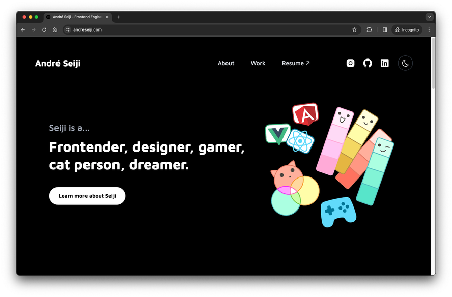
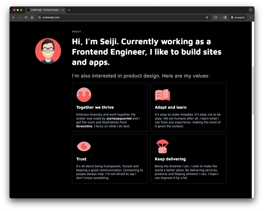
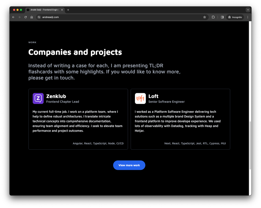
It's alright, but I wanted to make it better. Like Addy Osmany said once:
First do it, then do it right, then do it better.
For my website, I am now in the loop of always making it better, and better, and better...
Quick tip: Update your website every now and then. It's a good way to learn new things and improve your skills.
Another quick tip: If you are doing your first website, don't worry too much about it. Just do it. You can always change or update it later.
The tools and libraries I used #
Having used so many different tools and libraries in the past, I wanted to keep it simple this time, while also moving fast.
For tooling, I used Notion to plan and organize the project, Figma to design the website, and GitHub to version control the code. I also used Vercel to host the website and VS Code as my code editor.
For libraries, the base is React, Next.js, and Tailwind CSS. As I want to get more in-depth with them, learning more about their advanced features, it seemed like a good idea to use the same stack with updated versions (React 18.x, Next 14.x and Tailwind 3.x).
This is what my dependencies and devDependencies look like in my package.json file at the writing of this article:
{
	"dependencies": {
		"@heroicons/react": "^2.1.3",
		"@radix-ui/react-dropdown-menu": "^2.0.6",
		"classnames": "^2.5.1",
		"framer-motion": "^11.0.24",
		"next": "^14.1.4",
		"next-intl": "^3.10.0",
		"next-plausible": "^3.12.0",
		"next-themes": "^0.3.0",
		"react": "^18.2.0",
		"react-dom": "^18.2.0",
		"sharp": "^0.33.3"
	},
	"devDependencies": {
		"@types/node": "^20.11.30",
		"@types/react": "^18.2.73",
		"@types/react-dom": "^18.2.23",
		"@typescript-eslint/eslint-plugin": "^6.21.0",
		"@typescript-eslint/parser": "^6.21.0",
		"autoprefixer": "^10.4.19",
		"eslint": "^8.57.0",
		"eslint-config-next": "^14.1.4",
		"eslint-config-prettier": "^9.1.0",
		"eslint-plugin-no-relative-import-paths": "^1.5.3",
		"postcss": "^8.4.38",
		"prettier": "^3.2.5",
		"prettier-plugin-tailwindcss": "^0.5.13",
		"tailwindcss": "^3.4.3",
		"typescript": "^5.4.3"
	}
}
I would consider a fair amount for what I wanted to do. Not too much, not too little. Let's break down the dependencies:
Next.js, React and Tailwind CSS #
I started the project with create-next-app, with the following options:
What is your project named? `andreseiji.com`
Would you like to use TypeScript? `Yes`
Would you like to use ESLint? `Yes`
Would you like to use Tailwind CSS? `Yes`
Would you like to use `src/` directory? `Yes`
Would you like to use App Router? (recommended) `Yes`
Would you like to customize the default import alias (@/\*)? `No`
This generated a project with most of the dependencies I needed already.
Internationalization (i18n) #
One missing feature on my previous website was localization. I wanted to have my website available in Brazilian Portuguese, my native language. For this version, I decided to use next-intl. It has great integration with Next.js app router, and once the setup is done, it's easy to use.
Theme switcher #
While Tailwind CSS makes implementing a dark theme very straightforward, and it is simple to implement a theme switcher, I used next-themes because it provides a more robust solution, with more features like live syncing all open tabs and support for multiple themes.
Analytics #
I wanted to have some basic analytics. I decided to use Plausible mainly because it's privacy-friendly. It's also simple to use and I don't need a lot of data for my website. The next-plausible library is the official recommended way to add Plausible to a Next.js project.
Icons and UI components #
For iconography, I used Heroicons. They are simple, clean, and easy to use. They are imported as modules, so I can use only the icons I need, reducing the bundle size. The background pattern is from Hero Patterns.
I also used Radix UI for the dropdown menu. Libraries like Radix UI are great for building accessible UI components. If you are using React, Headless UI is another great option.
Animations #
I used Framer Motion for animations. As my content is presented in a timeline, I thought it would be nice to make each item appear with a fade-in effect. I think it adds a nice touch to the website and shows thoughtfulness.
I tried not to overdo it, though. Animations should be used to enhance the user experience, not to distract or annoy the user.
Other libraries #
- classnames: a great utility for conditionally joining class names together, very useful to create components with variations.
- sharp: a high-performance image processing library. Required by Next.js to optimize images.
- Some ESLint and Prettier plugins to keep the code clean and consistent.
A final thought on the tools and libraries #
I like either using what I am most comfortable with to move fast, or trying new things to learn more. In this project, I did a bit of both. I used tools I was already familiar with, like React, Next.js, and Tailwind CSS, but I also tried new libraries, like next-intl and Framer Motion.
Whatever you choose, make sure it fits your needs and goals. Don't use a library just because it's popular or because everyone else is using it. Use it because it solves a problem you have. Make every choice intentional.
Don't be afraid to try new things, but also don't be afraid to stick with what you know. Balance is key.
The best practices I followed #
Planning #
As a developer, sometimes all I want is to jump into the code and start building. But planning is important.
Before starting the project, I planned everything most things in Notion. I created a new page for the project, where I wrote what I wanted to have, and the tools and libraries I would use.
I used the Landing Page Board to help me define the main content, and from there, I created a mockup in Figma. I also created a list of tasks on Todoist to keep track of what I needed to do, especially because I wanted to finish it all in under 10 days.
Design #
I designed the website in Figma. To keep it simple, I started with a neutral color palette from Tailwind CSS colors and something more like a wireframe.
I thought it would be nice to have a timeline to show my professional journey. It could also represent git branches, where each route is a different branch.
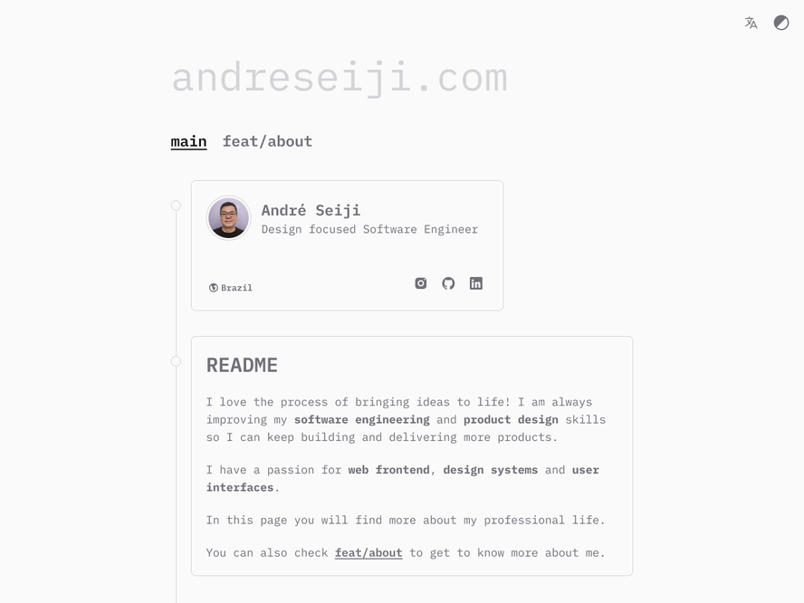
I usually go for simpler UIs and clean designs, but this time I wanted something bolder, more colorful and playful. I then iterated the design to give it a kinda brutalist look. It was fun to experiment with more colors!
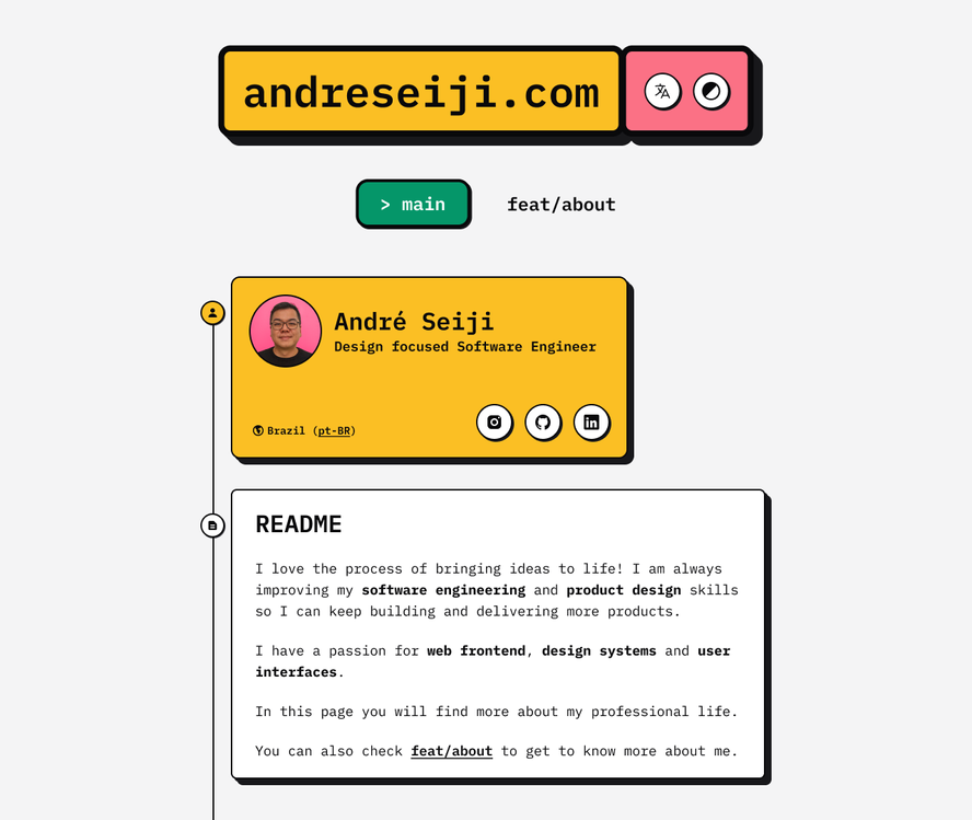
Even though I wasn't 100% sure about the design, I decided to start coding this version. I knew I could always change it later.
Development #
I started the project with create-next-app, and I used the options I mentioned earlier.
The first thing was the project setup, configuring my Prettier and ESLint preferences with helpful plugins for what I was going to use.
Then I moved to next-intl to account for the internationalization from the beginning.
I created the main components, like the header, footer, and timeline. I used Tailwind CSS for styling, and I tried to keep the components small and reusable.
Once I had all the components, I started adding more content. The modular structure of the site makes it easy to move cards and content around.
The final thing I added were the animations. While they add a lot to the look and feel, they are not essential. I could have launched the website without them, and it would still be functional.
Always remember to prioritize the essential features. You can always add more later.
Typography #
For the typography, I decided to use only one font family, IBM Plex Mono, with two weights.
Using a few fonts helps with performance, as the browser doesn't need to download multiple font files. It also helps with consistency, as you don't have to worry about different fonts clashing.
Performance #
Next.js is already optimized for performance, but there are always things you can do to make it even faster, like:
- Picking just a few fonts
- Optimizing images
- Using Priority for the Largest Contentful Paint (LCP) element
- Using only libraries and code I actually needed
By following these practices, I was able to achieve a Lighthouse score of 100s on Desktop. Mobile wasn't bad either, with 98 for Performance.
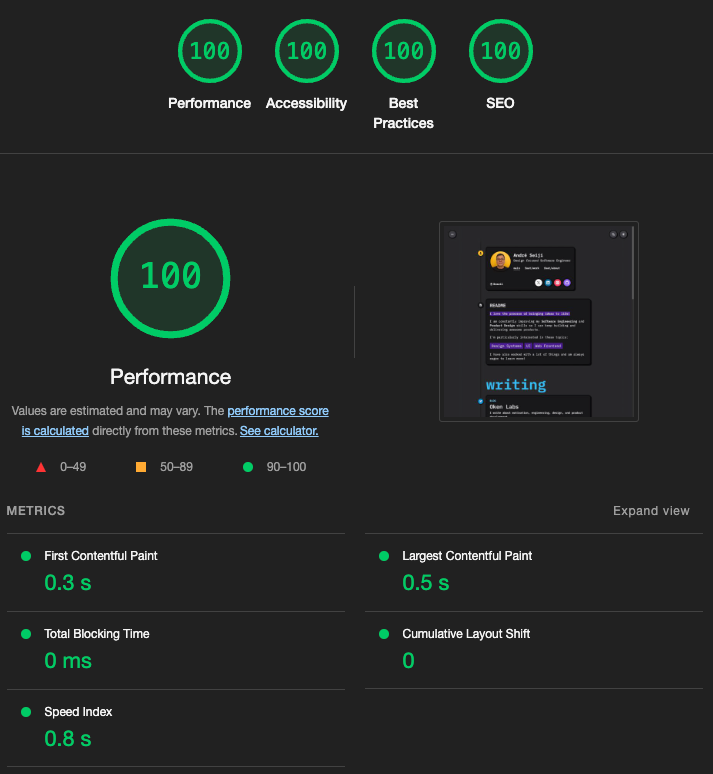
To better understand Core Web Vitals, definitely check web.dev. It's a great resource.
It's also important to understand that lab data (like Lighthouse) is not the same as field data (real user data).
SEO #
For SEO, I made sure to have:
- A descriptive title and meta description
- A good URL structure
- Alt text for images
- A sitemap
- A robots.txt file
If you are using Next.js, check the Metadata Files API Reference.
After publishing the website, I configured it on Google Search Console.
Accessibility #
I may not be an expert, but I care for accessibility and try to at least implement the basics, like:
- Having semantic HTML
- Adding alt text to images (when it makes sense, sometimes it's better to leave it empty)
- Using ARIA attributes when needed
- Ensuring contrast ratios are good for both light and dark themes
- Using focus traps where it makes sense (like the dropdown menu)
I wrote about implementing focus traps on a previous article.
CI/CD #
I used Vercel for hosting, which has such well-integrated CI/CD that I can publish new versions in just a few minutes. Every time I push to the main branch, it automatically deploys the website. It's fast and reliable.
I also set up a custom domain, and I configured the DNS records to point to Vercel.
Content #
There is a saying that "content is king". And it's true. You can have the best design and the best performance, but if the content is not good, the website won't be either. I made sure to write about myself trying to show my personality, and to showcase my work in a way that is easy to understand.
I think I still can improve a lot on this aspect, and it's a good thing I can keep iterating on it.
Iteration #
After launching the website, I asked for feedback from friends and colleagues. I also used Lighthouse to check the performance and accessibility.
I made some changes based on the feedback, like reviewing the menu so the first thing you see is the timeline, and making the header sticky for easier navigation.
I will keep improving it.
The final result #
"Final" meaning the current version, as I am always looking to improve it. Here is a screenshot I took on the date of this article:
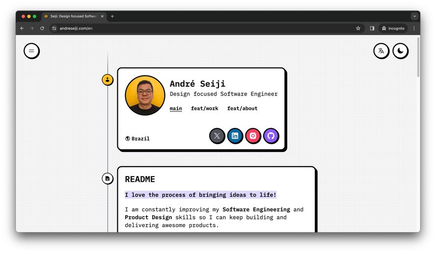
Maybe by the time you are reading this article, the website has changed. If you want to check it out, you can access it at andreseiji.com
Thanks for reading #
I hope you found this article useful. I tried to cover the main aspects of remaking a website, from planning to launching. I hope you can take something from it and apply it to your own projects.
- Next post: Taking a break
- Previous post: Brag Document: write your own
